📋 Table of Contents
🎯 Brand Overview
Who We Are
SPARK4BRAND is a strategic growth partner that combines three core capabilities into one integrated approach: China sourcing, strategic branding, and AI-powered growth.
Brand Promise
We transform entrepreneurs' visions into market dominance through real expertise, not agency tactics.
Brand Personality
- Expert - 25+ years of hands-on experience
- Innovative - AI-powered solutions for modern growth
- Integrated - No silos, everything connected
- Results-Driven - Your success is our success
- Premium - First-class quality and professionalism
Core Values
1. Partnership First
We're partners, not vendors. Your success is our success.
2. Results-Driven
Focused on measurable outcomes, not vanity metrics.
3. Innovation
Cutting-edge AI technology combined with proven strategies.
🎨 Brand Identity
Brand Essence
Integrated Excellence
We bring together sourcing, branding, and AI growth into one seamless strategic partnership.
Brand Positioning
| Element | Description |
|---|---|
| For | Entrepreneurs and businesses with great product ideas |
| Who | Need to source, brand, and scale their products |
| SPARK4BRAND is | A strategic growth partner |
| That | Provides integrated sourcing, branding, and AI-powered growth solutions |
| Unlike | Traditional agencies that work in silos |
| We | Combine real expertise with cutting-edge technology for complete market dominance |
Tagline
"Sourcing. Branding. Growth. Integrated."
🎨 Logo Usage
Primary Logo
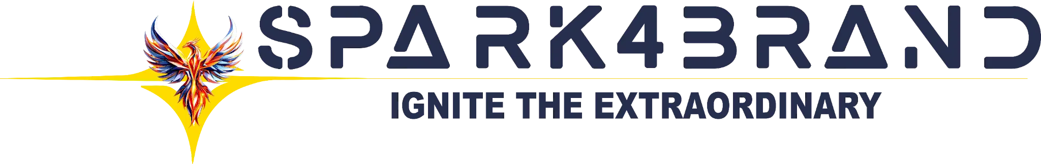
File: S4BLogo-BannerBlue.webp
Usage: Primary logo for all applications
Logo Specifications
- Format: Navy blue text with "SPARK4BRAND" wordmark
- Colors: Primary Navy (#001a4d)
- Background: Use on white or light backgrounds
Logo Clear Space
- Maintain clear space equal to the height of "4" on all sides
- Never place logo on busy backgrounds
- Ensure high contrast with background
Logo Minimum Size
- Digital: 120px width minimum
- Print: 1 inch width minimum
Secondary Logo (Icon)
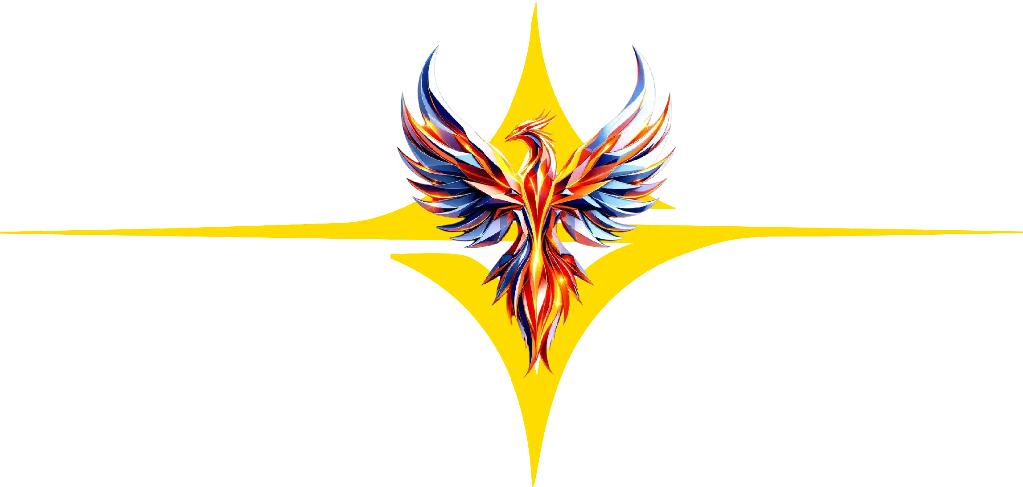
File: S4BPhoenixLogo.webp
Usage: Favicon, app icons, social media profile pictures
Icon Specifications
- Symbol: Phoenix representing transformation and growth
- Use Cases: Favicon, app icons, social media avatars
- Minimum Size: 32px × 32px for favicon
Logo Usage Guidelines
✅ Do
- Use the original logo files
- Maintain proper clear space
- Use on high-contrast backgrounds
- Scale proportionally
- Respect minimum sizes
❌ Don't
- Stretch or distort the logo
- Change logo colors
- Add effects (shadows, glows, outlines)
- Rotate the logo
- Place on low-contrast backgrounds
- Recreate or modify the logo
Logo Downloads
Available Logo Files:
🎨 Color Palette
Primary Colors
Primary Navy
Primary brand color, headlines, CTAs
Secondary Navy
Accents, secondary buttons, hover states
Accent Colors
Accent Gold
Highlights, icons, premium elements
Accent Green
Growth indicators, AI elements, success
Interactive Color Reference
View the full interactive color palette with click-to-copy functionality: color-palette.html
📝 Typography
Font Stack
font-family: -apple-system, BlinkMacSystemFont, 'Segoe UI', Roboto,
             'Helvetica Neue', Arial, sans-serif;
Usage: All body text, UI elements, general content
Type Scale
| Element | Size | Weight | Line Height |
|---|---|---|---|
| H1 | 48px | 700 | 1.2 |
| H2 | 36px | 700 | 1.3 |
| H3 | 28px | 700 | 1.4 |
| Body Large | 18px | 400 | 1.7 |
| Body Regular | 16px | 400 | 1.7 |
| Body Small | 14px | 400 | 1.6 |
✨ Icon System
Icon Style
- Style: Premium 3D icons with gradients and glows
- Format: PNG with transparent backgrounds (sRGBA)
- Resolution: 1024x1024px source, scalable
- Colors: Navy blue, gold, green (brand palette)
Icon Categories
Story/Journey Icons
Beginning
Glowing lightbulb
Challenge
Puzzle pieces
Solution
Connected network
Today
Rocket launching
Value Icons
Partnership
Hands shaking
Results
Target bullseye
Innovation
Circuit lightbulb
Service Icons
China Sourcing
Container with globe
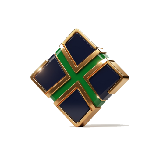
Brand Building
Diamond crown
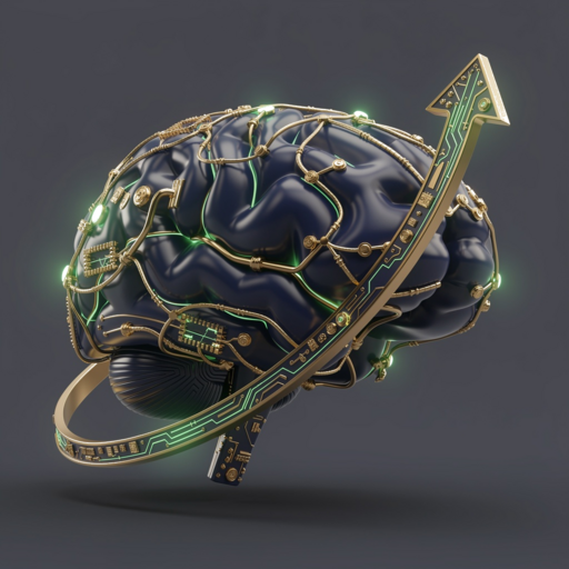
AI Growth
AI brain with arrow
Usage Guidelines
✅ Do
- Use icons on clean backgrounds
- Maintain icon proportions
- Ensure 20px minimum padding
- Use consistent sizes per section
- Apply subtle hover animations
❌ Don't
- Stretch or compress icons
- Change icon colors or gradients
- Use low-resolution versions
- Place on busy backgrounds
- Mix with non-brand icons
💬 Voice & Tone
Brand Voice Characteristics
1. Expert but Approachable
We know our stuff, but we explain it clearly. Confident without being arrogant.
2. Direct and Honest
No fluff or marketing jargon. Straight talk about challenges and solutions.
3. Results-Focused
Lead with outcomes, not features. Quantify achievements when possible.
4. Partnership-Oriented
Use "we" and "together" language. Emphasize collaboration.
Words to Use
✅ Preferred
- Transform, Integrate, Partner
- Real expertise, Hands-on
- Strategic, Premium, First-class
- Market leader, Dominance
❌ Avoid
- Synergy, Leverage, Paradigm
- Revolutionary (overused)
- Best-in-class (without proof)
- Solutions (be specific)
🎯 Design Principles
1. Premium Professionalism
Every design element should reflect first-class quality with clean, spacious layouts and attention to detail.
2. Clear Hierarchy
Guide users through content with visual hierarchy using bold headlines, clear sections, and prominent CTAs.
3. Integrated Cohesion
Reflect our "integrated" positioning with consistent icon styles, unified colors, and connected visual elements.
4. Results-Oriented Design
Design with conversion in mind through clear CTAs, benefit-focused layouts, and minimal friction.
5. Modern Innovation
Show our tech-forward approach with smooth animations, modern UI patterns, and responsive design.
💻 Digital Applications
Website Design
| Element | Specification |
|---|---|
| Max Width | 1200px for content |
| Grid | 12-column responsive |
| Gutter | 32px between columns |
| Padding | 24px mobile, 48px desktop |
Button Styles
Spacing System (8px Base Unit)
| Size | Value | Usage |
|---|---|---|
| XXS | 4px | Minimal spacing |
| XS | 8px | Tight spacing |
| S | 16px | Standard element spacing |
| M | 24px | Component spacing |
| L | 32px | Section padding |
| XL | 48px | Large section spacing |
| XXL | 64px | Major section spacing |
📋 Quick Reference
Brand Essentials
- Colors: Primary Navy (#001a4d), Accent Gold (#ffd700), Accent Green (#00cc66)
- Typography: System fonts, H1: 48px/700, Body: 16px/400
- Icons: Premium 3D, Navy/Gold/Green, Transparent PNG
- Voice: Expert, Direct, Results-focused, Partnership-oriented
- Tagline: "Sourcing. Branding. Growth. Integrated."